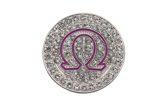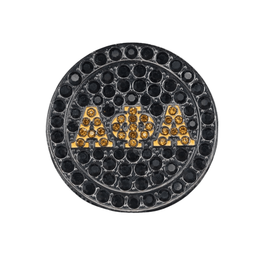

A crest is not clip art with a shiny finish. It carries Founders, chapter history, service, crossing memories, and the pride somebody feels when they put their letters on. That is why learning how to design organization crest jewelry starts with respect for the symbols before anybody chooses a stone, metal color, or ring style.
For a D9 member, that may mean knowing an ivy cannot be treated like a filler graphic, a pyramid needs clean structure, or a dove should still read clearly from across the room. For a smaller fraternity, sorority, military group, Masonic body, or faith-based organization, the standard is the same: your crest deserves jewelry that looks intentional, not like a generic blank piece with a logo stamped on top.
Start With the Crest, Not the Jewelry Blank
The strongest custom pieces begin with a clean, approved version of the organization crest. Ask for the original vector artwork when possible. Vector files preserve sharp edges, fine lettering, shields, scrollwork, and small symbols when the design is scaled for a ring face or pendant. A crisp PDF, AI, EPS, or SVG file is usually far more useful than a screenshot pulled from a chapter flyer.
If all you have is an older image, do not assume it can simply be engraved as-is. A crest that looks fine on a banner may become muddy when reduced to the size of a pinky ring. Tiny text can close up. Thin lines can disappear. Detailed elements can blend together once they are recessed into metal.
This is where a designer should simplify with discipline. The goal is not to redesign the crest. The goal is to preserve the details that make members recognize it instantly. Usually, that means protecting the shield shape, official letters, signature emblems, founding year, motto, or other core marks while cleaning up details that will not reproduce well at jewelry scale.
Confirm What Is Official
Before production begins, make sure the chapter or organization has approved the artwork and the use of its marks. This matters most for organizations with national branding standards, licensed insignia, or strict rules around colors and symbols. A chapter president, basileus, polemarch, dean, advisor, or national office may need to sign off depending on the organization.
There is a real difference between creating a personal tribute piece and producing jewelry for a whole chapter or membership base. If the design is going on a probate drop, line gift, anniversary collection, or public sale, get the permissions and internal approvals settled early. Nobody wants a fire design sitting in production while the group debates whether the old crest or current crest should be used.
Choose the Right Piece for How the Crest Will Read
A crest can work on several jewelry formats, but not every format gives the artwork the same visual power. The right choice depends on how detailed the crest is and where the member plans to wear it.
A signet ring is made for presence. It puts the crest front and center, making it a strong option for life member gifts, line brother pieces, chapter leadership recognition, and anniversary jewelry. Rings also give you room to add a founding year, chapter designation, line name, or personal initials along the sides.
Pendants are usually the better call when the crest has lots of fine detail or a taller, more vertical shape. A shield, coat of arms, or crest with a ribbon can breathe on a pendant without getting crowded. This is also a great format for a chapter piece that needs to work for everybody, from undergrads on the yard to alumni dressing for the gala.
Lapel pins are smaller by nature, so they require the most restraint. They are excellent for blazers, Founders' Day events, conventions, and formal chapter functions, but they should focus on the strongest visual elements. A full crest may need a simplified pin version that keeps the outline, central symbol, and key colors without forcing every tiny detail into a space the size of a coin.
Design Organization Crest Jewelry With Symbol Hierarchy
The question is not, “What else can we fit on it?” The better question is, “What should people see first?” Great crest jewelry has a clear hierarchy.
The crest or letters should lead. Then come supporting details such as a founding date, chapter name, city, line number, anniversary year, or a short motto. If every surface carries text, stones, graphics, and borders, the piece can start looking more crowded than commemorative.
Think about a classic organization ring. The face may carry the crest, while one side features the chapter letters and the other carries a date or emblem. That layout tells a story without yelling every part of it at once. On a pendant, the crest may take center stage with the organization name wrapped around the border or engraved on the back.
For line gifts, personalization can make the difference between a nice piece and a forever piece. Add a LineUp date, crossing season, chapter initials, line nickname, or number only when the organization culture and your line agree it belongs there. Some symbols are for public wear. Some memories are just for the prophytes. Good design knows the difference.
Match Metal, Color, and Finish to the Identity
Metal color changes the entire mood of a piece. Yellow gold brings warmth, tradition, and ceremony. It can be especially strong for anniversary gifts, founder tributes, and formal rings. Silver-tone finishes are crisp, versatile, and often make engraved lines stand out. Black finishes bring a bolder, more modern edge, especially for pieces designed to hit at a step show, cookout, or probate celebration.
Color should support the crest, not compete with it. Enamel is useful when official colors are a major part of recognition, such as a rich green leaf, a red pyramid detail, or a blue-and-white composition. But enamel also asks for enough surface area to read cleanly. On a smaller ring face, selective color can look better than trying to reproduce every shade in the official crest.
Raised and recessed finishes add another layer of contrast. A raised polished crest over a textured background can create serious depth. Recessed black enamel or dark antiquing can help fine engraving show up, particularly on silver-tone metals. The trade-off is care: highly polished finishes show scratches more readily, while textured or antiqued backgrounds can be more forgiving for everyday wear.
Make It Wearable Beyond the Photo Shoot
A piece can look perfect in a product mockup and still be uncomfortable in real life. That is why proportion matters. A wide-faced ring carries a bold crest well, but a member who works with their hands every day may prefer a lower profile. A heavy pendant has presence, but the bail and chain need to support its weight without flipping the piece backward all day.
Ask who this jewelry is for. Is it a first crossing gift for neos who want to rep their letters everywhere? Is it a 25-year chapter anniversary piece meant for the banquet and the family photo? Is it a lapel pin for sorors and brothers who want something clean on a blazer? The use case should shape the design.
Durability also deserves a real conversation. Plated jewelry makes bold organization pieces more accessible, but it needs normal care to keep its finish looking right. Remove it before swimming, heavy workouts, or using harsh cleaners. For a piece meant to stay in rotation for years, replacement and re-plating support can matter as much as the first look. FraternityRings.com builds that kind of long-term wear into the conversation because letters are not a one-season flex.
Use Mockups to Catch Problems Before Production
Never approve a crest piece from a written description alone. Review a digital mockup from the front, sides, and back. Look closely at spelling, chapter identifiers, dates, Greek letters, color placement, and the direction of symbols. Check that the crest sits centered and that the border has enough room around it.
Bring in more than one set of eyes. A chapter member who knows the history may catch a missing detail. A line brother may spot a wrong date immediately. Someone with no attachment to the artwork can tell you whether the crest is still readable at a glance. That mix protects both tradition and design quality.
For larger chapter orders, request a sample or prototype when the budget and timeline allow. It is easier to adjust an engraving depth, stone placement, or ring size before the full run than after every piece has shipped. Custom does not have to mean complicated, but it does reward a careful approval process.
The best crest jewelry does more than show affiliation. It gives members something they can wear to chapter, to the anniversary gala, to Founders' Day, or just out in the world when they want their story visible. Keep the symbols true, let the strongest details lead, and make the final piece worthy of the letters it represents.