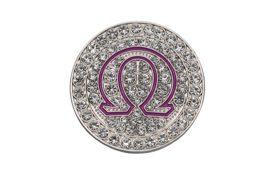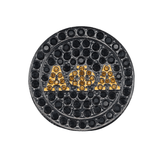

A chapter ring should not look like it came off a generic jewelry rack with a few letters squeezed onto the top. The best chapter ring design examples carry the details your people recognize before you say a word: the colors, symbols, chapter identity, line pride, and legacy behind the letters. Whether you are a neo looking for that first serious piece or a life member marking 25 years, the design should feel earned.
A good ring does more than match an outfit at the cookout or look clean in a probate photo. It holds up at the gala, the step show, founders' day, Sunday service, and every time somebody asks, “What chapter?” That is where thoughtful design separates a ring that is merely branded from one that tells your story.
Chapter Ring Design Examples That Start With the Letters
Your organization letters are the anchor. Everything else should support them, not compete with them. For many members, a bold raised-letter face is the right move because it reads from across the room and carries that classic fraternal weight. An Omega Psi Phi ring may center the Omega symbol with purple and gold enamel, while a Kappa ring can frame its letters with a diamond-inspired face or cane detail.
For a more refined look, consider recessed letters against a polished or textured background. Black onyx-style fields make gold letters hit hard. A white stone or silver-toned face can give royal blue, crimson, pink, green, or purple accents more contrast. The choice comes down to how you wear your jewelry. If your ring needs to speak first, go bold. If it will live beside a watch, wedding band, or other pieces, a cleaner face may fit your rotation better.
An Alpha-inspired design might place the fraternity letters over a sphinx detail, keeping the symbol visible without turning the face into a crowded collage. An AKA ring can use ivy winding around the shoulders while the letters stay centered. For Deltas, a pyramid silhouette or fortitude-inspired geometry can bring meaning to the side panels without taking the spotlight from the main face.
Let the Side Panels Carry the Chapter Story
The face gets attention, but the sides are where a chapter ring becomes personal. Think of them as two small canvases with a real job to do.
One panel might feature your chapter letters, founding year, or campus city. The other can hold a recognizable organization symbol: a dove for Zeta Phi Beta, a poodle for Sigma Gamma Rho, a centaur for Iota Phi Theta, or Phi Beta Sigma imagery that feels true to your brotherhood. For a chapter with a long local history, a campus landmark, state outline, or chapter anniversary mark can make the piece feel like it could belong to nobody else.
There is a trade-off here. Cramming the sides with a crest, mascot, full chapter name, crossing year, line number, slogan, and three extra symbols can make even a large ring feel busy. Pick the two or three details that matter most. Clean engraving ages better than a design that tries to tell every part of the story at once.
The Chapter Crest Ring
For multicultural Greek organizations, regional fraternities and sororities, and smaller orgs with a strong visual identity, the crest-forward chapter ring is often the move. Put the crest or shield on the face, then use organization letters and chapter details on the shoulders. It gives the piece a formal, ceremonial feel that works especially well for founders' day, conventions, anniversaries, and officer gifts.
A crest needs enough surface area to stay legible. If it has fine lines, several colors, or a motto in tiny type, a larger signet-style face will usually serve it better than a compact ring. Your letters deserve the same craftsmanship as the D9. Let’s build the design around what makes your organization yours, not around somebody else’s template.
The Line Pride Ring
Some pieces are about the organization as a whole. Others are for the line brothers and line sisters who crossed together and still show up for each other years later. A line-focused ring can include a crossing year, line name, number, or a subtle sequence detail along the shank.
Keep line identifiers respectful and intentional. A line name engraved inside the band can be a personal touch without making it the centerpiece. If the ring is a probate gift, matching side-panel details across the LineUp create a strong shared look while giving each person room for their individual number or initials.
Stone and Color Ideas That Do Not Feel Random
Stones can bring serious energy, but they should have a reason for being there. Organization colors are the natural starting point. Purple and gold for Ques, crimson and cream for Kappas, old gold and black for Alphas, royal blue and pure white for Sigmas, and the distinct colors of each sorority all create immediate recognition when done with balance.
A colored center stone delivers the loudest look. It is a strong choice for members who want the ring to be seen across the room. Smaller accent stones around a raised letter or symbol give off a more polished, jewelry-forward feel. If you want something you can wear every day, a dark center with color accents is often easier to pair with everything from business clothes to chapter gear.
Do not assume more stones automatically mean more luxury. Too much sparkle can pull attention away from a clean symbol or beautiful engraving. Stone settings also sit higher, which matters if you work with your hands, lift regularly, or need a ring that will not catch on every sleeve and steering wheel. The best design is not always the flashiest one. It is the one you will actually wear.
Four Ring Directions for Different Moments
A ring should match the moment it is made for. These four directions give you a useful starting point:
- The neo statement ring uses a large face, high-contrast letters, organization colors, and a confident symbol on each side.
- The chapter legacy ring adds chapter letters, a local landmark or crest, and a founding or anniversary year for members who want history in the metal.
- The line commemorative ring keeps the organization front and center while adding a crossing year, line name, or individual number in a secondary position.
- The life member ring goes more refined with detailed engraving, a meaningful stone, and a finish that works at banquets, worship, professional settings, and the family function.
Finish Choices Change the Whole Personality
Gold-tone finishes bring classic fraternal presence, especially with raised lettering and darker backgrounds. Silver-tone finishes feel crisp and modern, and they make blue, purple, crimson, and black color fields stand out. Two-tone designs can be especially effective when your organization colors or crest already use contrast.
Texture matters too. A polished face catches light and looks sharp in pictures. A sandblasted or antiqued background adds depth and helps raised details read clearly. Black enamel is a favorite for a reason: it makes letters pop. But it is not the only answer. White enamel can look clean and ceremonial, while colored fields can tie a full design together when they are used with restraint.
If you plan to wear your piece hard, ask about durability, re-plating, and replacement support before you settle on the finish. A chapter ring is not supposed to spend its life in a box because you are scared to wear it. FraternityRings.com stands behind pieces with lifetime re-plating and replacement support, because real org jewelry should be ready for real life.
Make It Personal Without Making It Too Busy
The strongest custom rings have a clear hierarchy. First, people see your organization. Second, they see your chapter or personal connection. Third, they discover the details when they get close. That order keeps the design proud, readable, and timeless.
Start with one question: what do you want this ring to say before you ever explain it? Maybe it is “I crossed with these brothers.” Maybe it is “This chapter built me.” Maybe it is “I have carried these letters for decades.” Once you know the answer, the right symbols, stones, engraving, and finish start to make sense.
Wear the piece that lets your letters speak clearly, then let the details handle the rest of the story.