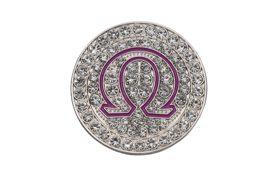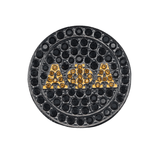

A ring can carry more than letters. It can hold a crossing year, a chapter nickname, a line number, a founders' day memory, and the pride of being part of something that was earned. The best custom chapter ring design example is not a random logo pressed into metal. It is a piece that looks right on the hand, reads clearly across the room, and still means something when the probate photos are old and the chapter has welcomed a new generation of neos.
A custom chapter ring design example, built with purpose
Picture a substantial signet-style ring created for a graduate chapter celebrating its 25th anniversary. The face carries the organization's approved Greek letters in raised detail, centered over a textured background in the chapter's primary color. A small, clean chapter designation sits beneath the letters - present, but not fighting for attention.
One shoulder features the chapter crest, simplified enough to stay crisp at ring scale. The other carries the anniversary years and a symbolic element tied to the organization's history, such as an ivy leaf, pyramid, dove, sphinx, cane, centaur, poodle, or another approved mark that members recognize immediately. Inside the band, the engraving reads: “25 Years of Service and Sisterhood” or “Built on the Line, Bound by Brotherhood.”
That is a strong build because every detail has a job. The face announces the affiliation. The shoulders tell the chapter story. The inside engraving makes the ring personal. It does not try to put the whole chapter brochure on one finger.
A custom ring can lean ceremonial, with polished gold tones and formal crest work for an anniversary gala. Or it can go bold and yard-ready, with darker metal, raised letters, and color accents that show up when the chapter is stepping, strolling, or taking group photos at the cookout. The right direction depends on who will wear it and where.
Start with the chapter story, not a catalog image
A ring design gets better when the chapter answers one question first: what moment is this piece meant to honor? A crossing gift for a line has a different energy than a life member ring. A chapter fundraiser piece needs broad appeal. An anniversary design may need more room for dates, a commemorative seal, or a service theme.
For a line gift, line name, ship name, year, and individual number may matter most. For a chapter milestone, the charter year, city, anniversary count, and a chapter-specific phrase can make the ring feel like it belongs to the people who built that legacy. For a smaller fraternity, sorority, multicultural council organization, or local organization, the crest and colors may carry the weight that a widely recognized symbol carries for D9 members.
That is the advantage of custom work. Your letters deserve more than a close-enough template. They deserve a design that knows exactly who it is representing.
Choose the details that will still read at ring size
The ring face is not a billboard. It has limits, and good design respects them. Tiny text, overly detailed seals, and too many symbols can turn a meaningful idea into a busy piece of metal. A chapter can have a deep history without squeezing every date, motto, and icon onto the exterior.
Make the face the headline
Usually, the strongest choice is to let the organization letters, crest, or primary symbol own the face. Raised Greek letters bring immediate presence, especially on a traditional signet profile. A recessed background can add contrast and make the lettering pop without needing extra decoration.
If the chapter wants color, use it with intention. Enamel or colored accents can highlight a background field, a gemstone-style center, or a narrow border. Too much color can make a ring feel more like a novelty piece than a lasting chapter keepsake. Sometimes polished metal and strong relief work do more talking.
Let the shoulders carry the supporting story
The shoulders are where custom chapter rings get personal. One side can show an approved crest or symbol, while the other carries a chapter designation, founding date, city, or milestone year. For a line order, the shoulders can split the story between a line identifier and an individual detail.
There is a trade-off here. More customization makes each ring feel more personal, but individual variations can affect the production plan for a group order. If the goal is a clean chapter piece that every member can wear, keep the exterior consistent and use inside engraving for names, numbers, or private line details.
Pick a metal finish that matches the wear
A bright yellow-gold look brings classic ceremonial energy. Silver-tone finishes tend to feel sharp, versatile, and easy to pair with everyday fits. Darker finishes can deliver a more modern, harder-edged chapter flex. The choice is not only about color - it is about how members plan to wear the ring.
A highly polished finish catches light beautifully at formal events, but it will show everyday surface wear sooner than a more textured or satin finish. That is not a flaw. It is the reality of jewelry that gets worn to meetings, brunches, homecoming, and every function in between. Choose the look you will actually put on, not just the one that looks best in a mockup.
Keep the engraving personal and readable
Inside engraving is where a ring can become somebody's ring. A name, crossing season, line number, chapter, anniversary date, or short phrase works well. Keep it concise. A phrase with real weight beats a full paragraph every time.
“Spring '14,” “7th on the Line,” “Chartered 1999,” or “Forever My Chapter” can say plenty. If the piece is a gift, inside engraving is also a clean way to honor a prophyte, chapter president, spouse, parent, or line brother without changing the public-facing design.
Build from approved artwork and clear direction
Before any custom ring moves forward, gather the artwork that represents the organization correctly. That may include the official crest, approved Greek letters, chapter designation, colors, and any symbols the organization permits for jewelry. A clean vector file is ideal, but a high-quality image can also help establish the direction.
Then decide what cannot be compromised. Maybe the chapter must have its charter year on the ring. Maybe the crest has to be on the left shoulder. Maybe the entire point is to create a bold piece around a signature symbol. Those non-negotiables help the design stay focused when choices start piling up.
A good proof stage matters. Review spelling, dates, Greek letters, proportions, symbol placement, and the way details interact from every angle. The chapter should not approve a design just because it looks good at first glance. Ask whether it still looks like your chapter, whether the lettering is clear, and whether members will be proud to wear it five years from now.
Custom does not have to mean complicated
For a chapter officer organizing a group piece, the process should feel clear: share the vision, submit the approved artwork, choose the ring direction, review the proof, and make sure members know the available personalization options. The hardest part is usually getting everybody to agree on one exterior design - because every chapter has at least one member ready to add three more symbols to the shoulder.
FraternityRings.com helps organizations turn that chapter vision into jewelry with presence, whether the project is for a D9 chapter, a growing regional fraternity, a sorority with its own crest and traditions, or a milestone group that wants something members will keep wearing. The goal is not to make a generic ring with different letters. The goal is to make the piece feel like it came from your chapter.
When the final design is right, it does not need a long explanation. Your letters are clear. Your chapter story is there. And when a soror, a line brother, or an old prophyte catches it across the room, they know exactly what that ring represents.